TASK 1:
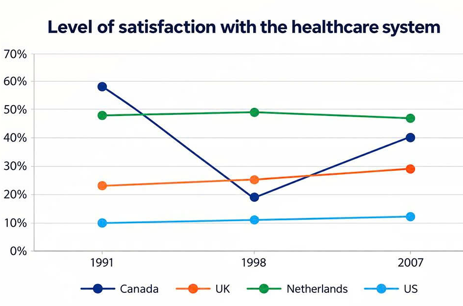
Question: The graph below shows people’s level of satisfaction with the health care system in 4 countries between 1991 and 2007. Summarize the information by selecting and reporting the main features, and make comparisons where relevant.
ANSWER:
The line graph compares the percentages of people who were satisfied with the healthcare system in Canada, the UK, the Netherlands and the US in 1991, 1998 and 2007. Overall, Canada saw a sharp decline in satisfaction followed by a considerable recovery, while the figures for the other three countries remained relatively stable. The Netherlands had the highest satisfaction levels for most of the period, whereas the US consistently recorded the lowest figures.
Regarding Canada, the proportion of people satisfied with its healthcare system stood at approximately 58% in 1991, the highest figure shown on the graph. However, this percentage fell dramatically to just under 20% in 1998 before recovering considerably to around 40% in 2007. The Netherlands, by contrast, experienced very little change, with its figure remaining at approximately 48–49% in the first two years and then declining slightly to about 47% in 2007.
Turning to the UK, around 22% of people were satisfied with the healthcare system in 1991. This figure increased gradually to approximately 25% in 1998, followed by a further rise to 28% in 2007. A similar but less pronounced upward trend was seen in the US, where the proportion edged up from around 10% in 1991 to 11% in 1998, eventually reaching approximately 12% in the final year. (214 words)

