TASK 1:
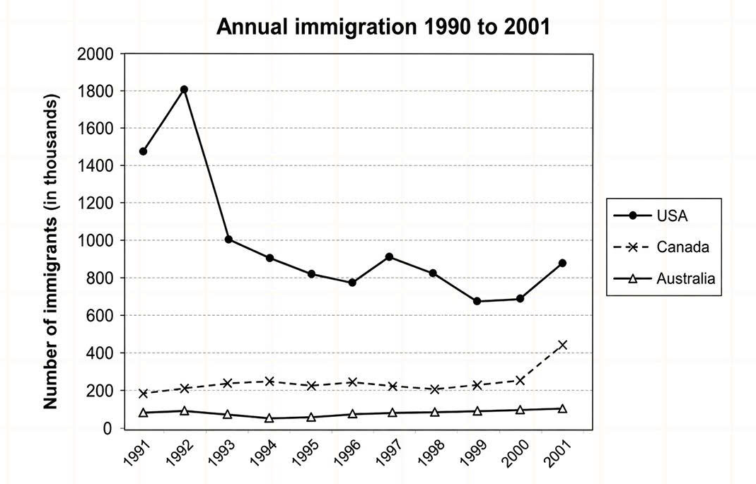
Question: The graph below shows the number of immigrants to three countries form 1990 to 2001.
ANSWER:
The line chart compares the number of individuals migrating to three different nations annually between 1990 and 2001. Overall, the USA documented a downward trend over the surveyed period, while Canada increased and Australia remained fairly stable. Additionally, the number of immigrants per annum to the USA was consistently the highest, while that of Australia witnessed the lowest throughout.
Regarding the only decreasing category, approximately 1,450,000 people moved to the USA in 1991, which then surged to a peak of 1,800,000 in the following years. Subsequently, it recorded a significant plunge to roughly 650,000 by 1999, prior to a recovery to around 850,000 individuals in the end.
As for the remaining nations, Canada welcomed precisely 200 immigrants in 1991. After a minimal rise to about 230,000 in 1993 and 1994, the figure receded to its initial point in 1996 and experienced a fair plateau until 2000, before growing suddenly to 400,000 individuals in the end. Lastly, approximately 100,000 people decided to relocate to Australia each year for the majority of the given timeframe, despite a slight drop to roughly 50,000 in 1994 and 1995.
(184 words)

