TASK 1:
Question: The charts below show the global market ratio of the three computer operating systems compared to others from 2012 to 2015.
ANSWER:
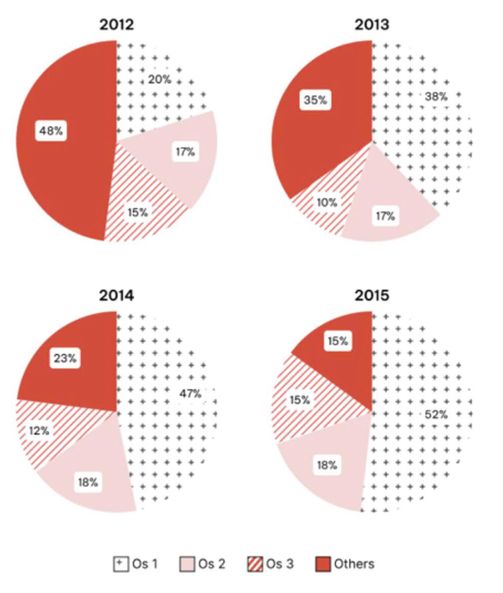
The pie charts illustrate the global market share of three computer operating systems, namely OS1, OS2 and OS3, compared with other systems, between 2012 and 2015. Overall, OS1 witnessed a remarkable increase and eventually became the dominant operating system, whereas the proportion of other systems declined considerably. By contrast, the figures for OS2 and OS3 changed only marginally over the period.
Regarding OS1 and other operating systems, the latter initially held the largest market share in 2012, at 48%, which was more than twice as high as the figure for OS1, at 20%. However, this pattern was reversed in 2013 when OS1 surged to 38%, overtaking other systems, whose share dropped to 35%. The upward trend for OS1 continued afterwards, reaching 47% in 2014 before peaking at 52% in 2015. In contrast, the percentage of other systems declined steadily to 23% and then halved further to only 15% in the final year.
Turning to OS2 and OS3, both accounted for relatively small proportions throughout the period. OS2 remained stable at 17% in both 2012 and 2013, followed by a slight rise of 1% in the final two years. Meanwhile, OS3 started at the lowest result of 15%. After falling to a low of 10% in 2013, it recovered to end the period at 15%.
(214 words)
